
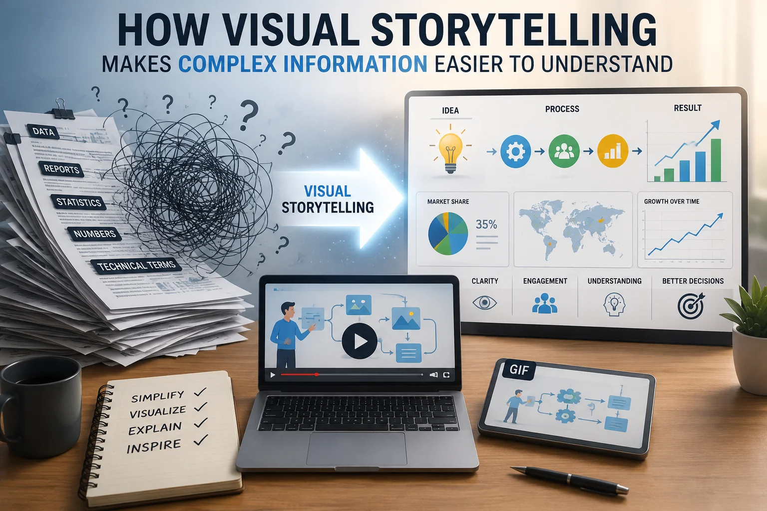
Complex information is everywhere. It appears in business reports, product tutorials, educational materials, research findings, marketing campaigns, and even everyday workplace communication. Yet the more complicated a subject becomes, the harder it is to explain clearly. Long paragraphs, technical terminology, and dense data can overwhelm readers before they fully understand the main point. Visual storytelling solves this problem by turning abstract ideas into something people can quickly see, follow, and remember.
A short animation can demonstrate a process more effectively than several paragraphs of instructions, while a simple diagram can reveal relationships that may be difficult to describe with words alone. Content creators can also use a video to GIF converter to transform an important moment from a longer recording into a lightweight visual that explains a step, highlights a feature, or shows a change in seconds. When visuals are selected with purpose, they do more than decorate content. They guide attention, simplify meaning, and help audiences understand what matters.
Why Complex Information Is Difficult to Process
People do not struggle with complex information because they lack intelligence. They struggle because working memory has limits. When readers are presented with too many unfamiliar ideas at once, they must spend significant mental energy organizing the information before they can understand it.
Imagine opening a report filled with technical terms, long sentences, percentages, and multiple conclusions. Even if the information is accurate, the reader may not know where to begin. Important insights can disappear inside the volume of detail.
Visual storytelling gives structure to that information. It creates a clear path through the subject by showing the order, relationship, scale, or meaning of different elements.
For example, instead of describing how website traffic moves from social media to a landing page and then into a sales funnel, a marketer can create a simple flowchart. The audience sees the full journey immediately. The visual reduces the mental work required to connect each stage.
That reduction in mental effort is one of the main reasons visual communication is so effective.
Visuals Turn Abstract Ideas Into Concrete Experiences
Some concepts are difficult to understand because they cannot be observed directly. Ideas such as business growth, customer behavior, financial risk, cybersecurity, or workflow efficiency are often abstract. They become easier to understand when they are represented visually.
A line graph can show growth over time. A heat map can reveal where users focus their attention. A before-and-after comparison can demonstrate the impact of a design change. An animated sequence can explain how a system responds to different actions.
This works because visuals give abstract information a shape.
Consider a company trying to explain how much time employees lose because of inefficient approval processes. A written statement might say that delays occur across several departments. A visual workflow, however, can show exactly where requests become stuck, how long each stage takes, and which teams are affected.
The audience no longer has to imagine the problem. They can see it.
Good Visual Storytelling Creates a Clear Narrative
Visual storytelling is not simply the practice of adding images to an article. A collection of attractive graphics does not automatically create understanding. Effective visual storytelling follows a narrative.
Like any strong story, it should answer several basic questions:
What is happening? Why does it matter? What changes over time? What should the audience notice? What conclusion should they reach?
A useful visual sequence often begins with the current situation, introduces the main challenge, and then shows a solution or result.
For instance, a software company explaining a new feature might start with a screenshot of the old manual process. The next visual could show the feature being activated, followed by a final image demonstrating the completed automated workflow.
This sequence creates movement. It helps the viewer understand not only what the feature does, but also why it is useful.
The strongest visual stories are designed around the audience’s journey rather than the creator’s desire to display information.
Data Becomes More Meaningful When It Has Context
Numbers are valuable, but they rarely communicate their full meaning on their own. Saying that customer satisfaction increased by 18 percent sounds positive, but the audience may still wonder what caused the improvement, when it happened, or how significant it was.
A visual can provide that context.
A chart might show satisfaction levels before and after a new support system was introduced. An annotation could highlight the exact date of implementation. A second visual might compare the result with the industry average.
Suddenly, the number becomes part of a larger story.
This is especially important in business communication. Executives, clients, and stakeholders often need to make decisions quickly. They may not have time to study every detail in a lengthy report. A carefully designed visual summary can help them identify patterns, risks, and opportunities without oversimplifying the facts.
However, clarity should never come at the expense of honesty. Charts should use appropriate scales, labels, and comparisons. A visual that exaggerates a small difference may attract attention, but it damages trust.
Motion Can Explain Processes Better Than Static Content
Static images work well for comparisons, structures, and summaries. Motion is particularly useful when the subject involves a sequence of actions.
This includes software tutorials, manufacturing processes, scientific demonstrations, customer journeys, and step-by-step instructions.
Suppose a company wants to teach users how to change a setting in its mobile app. A written guide may require several numbered steps. Screenshots can make the instructions clearer, but a short looping animation can show the entire action in context.
The user sees where to tap, what changes on the screen, and what the final result should look like.
Motion is also effective for showing cause and effect. An animated graphic can demonstrate how changing one variable influences another. This is especially helpful when explaining systems, trends, or processes that develop over time.
The key is to keep motion focused. Too many moving elements can become distracting. Every animation should have a clear purpose and direct attention toward the main idea.
Visual Stories Improve Memory and Recall
People are more likely to remember information when it is connected to a meaningful image or sequence.
A paragraph may explain the stages of a process accurately, but a visual timeline gives each stage a distinct position. A reader can later recall where an event appeared in the sequence, what symbol represented it, or how it connected to the next step.
This is why visual storytelling is so useful in education and training.
Teachers can use diagrams to explain scientific systems. Trainers can use illustrated scenarios to demonstrate workplace safety. Healthcare professionals can use visual guides to help patients follow treatment instructions.
In each case, the visual becomes a memory cue.
The goal is not to remove written explanation. It is to combine language and imagery so that each supports the other.
Real-Life Examples of Visual Storytelling
Visual storytelling appears in many familiar situations.
A public transportation map simplifies a complex network of stations and routes. It does not reproduce the city’s exact geography. Instead, it prioritizes the information passengers need to navigate successfully.
An e-commerce size guide uses illustrations to show where customers should measure their body. This reduces confusion more effectively than written instructions alone.
A project dashboard uses progress bars, status icons, and timelines to help teams understand what has been completed, what is delayed, and what requires attention.
A news organization may use an interactive map to show how an event developed across different regions. Readers can explore the information geographically rather than sorting through a long list of locations.
These examples work because the format is matched to the message.
How to Create Visual Content That Actually Clarifies
The first step is identifying the central idea. Before designing anything, decide what the audience should understand after viewing the visual.
Trying to explain too much at once usually leads to clutter. A visual should focus on one primary message, even when the broader topic is complex.
Next, choose the format based on the type of information.
Use charts for comparisons and trends. Use diagrams for relationships and systems. Use timelines for events and progress. Use short animations for movement and instructions. Use annotated screenshots for digital tools and interfaces.
It is also important to create a clear visual hierarchy. The most important element should attract attention first. Supporting details should appear in a logical order.
Labels should be brief and readable. Colors should have meaning rather than being used only for decoration. Icons should be familiar enough that viewers understand them without additional explanation.
Finally, test the visual with someone who is not closely involved in the project. Ask them what they noticed first and what conclusion they reached. Their response will reveal whether the visual communicates the intended message.
Common Mistakes to Avoid
One common mistake is adding visuals that repeat the text without providing additional clarity. A generic stock image may make a page look more polished, but it does not necessarily help the reader understand the subject.
Another mistake is overcrowding the design. Small labels, excessive icons, decorative effects, and too many colors can turn a helpful visual into another source of confusion.
Creators should also avoid assuming that every viewer will interpret a visual in the same way. Context, labels, and short explanations are often necessary.
Accessibility matters as well. Text should have sufficient contrast, videos should include captions when appropriate, and important information should not depend entirely on color. Alt text can help users who rely on screen readers understand the role of an image.
Effective visual storytelling should make information easier to access, not create new barriers.
Combining Words and Visuals for Maximum Impact
Words and visuals are most powerful when they work together.
Text provides precision, explanation, and nuance. Visuals provide structure, emphasis, and immediate context. Neither needs to replace the other.
A well-written article may introduce a problem, use a diagram to show how the problem develops, and then provide practical advice in text. A presentation may use a chart to highlight a trend while the speaker explains the reasons behind it.
The purpose of the visual is to support understanding at the exact moment the audience needs it.
That requires thoughtful placement. A chart should appear near the section that discusses its findings. An animation should be introduced with enough context that viewers know what to watch. A screenshot should include annotations that point to the relevant feature.
When these elements are coordinated, the content feels effortless to follow.
Conclusion
Visual storytelling makes complex information easier to understand because it gives ideas structure, context, and movement. It helps audiences recognize patterns, follow processes, remember key details, and make informed decisions without becoming overwhelmed.
The most effective visuals are not necessarily the most elaborate. They are the ones that communicate a clear idea with the least unnecessary effort. Whether the format is a chart, diagram, animation, screenshot, or timeline, every element should serve the reader.
When visual storytelling is approached with intention, complicated subjects become more accessible, engaging, and memorable. That is what transforms information from something people simply read into something they genuinely understand.
See more amazing Information visit ostrichdigest